

A good decoration style is inseparable from the choice of wood finishes. A good design plan can make the designer famous. There are many colors of wood veneer panels. Different colors are matched together and set off with the furniture. The saturation of the colors and the selection of the furniture will make the decoration effect different. According to the visual effect, when light-colored and dark-colored wood veneers are mixed and matched with electricity, the light color becomes lighter and the dark color becomes darker.
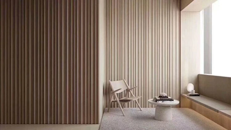
Therefore, in the color matching, the overall decoration style, and the furniture color can be used in the same tone color matching, or similar tones can be used. Of course, contrast color matching is also a good choice. The difference will result in a vivid color contrast effect. If you want your own home to be warm and comfortable, you must have a set of overall color schemes from the beginning of the design, and make full use of different wood veneer color styles. Here are a few kinds of board matching schemes.
1. Blue + white-free and comfortable style
In general home decoration, most people don’t like to try bright colors. If the colors are too gorgeous and single, they will be messy in space. If they are all white and not very good, they will be too monotonous, so blue and white are more The color scheme is safe. It feels like a remote island in Europe. Although the houses are white, the sky and the sea are blue. The scene where the sea and the sky meet gives people a feeling of fascination. The decoration scene makes people feel very free and comfortable. The design of the home space in this color scheme is tantamount to a kind of beautiful enjoyment.
2. Black + white + gray-classic decoration style
These three different colors are also commonly used by designers. It can be said that they are timeless and classic themes. Black and white have a strong visual impact, and gray can alleviate the visual conflict between black and white. The combination of the three colors is not so abrupt. The overall decoration effect is full of a cool modern futuristic sense of technology. This style is more popular among young people.
3. Yellow + green-comfortable rural style
In the selection of home furnishing materials, yellow is more popular, especially goose yellow. Goose yellow gives a sense of fashion and freshness, while green is the color that makes people feel calm and refreshing. It can be neutralized with goose yellow. The two colors have a relaxed, pleasant, and energetic feeling when matched together. This style of matching is more suitable for young couples who are newly married.
4. Blue + orange-retro decoration style
The wood veneer colors are mainly blue and orange. These two colors are strong contrast colors, which not only show modern beauty but retain a trace of traditional beauty. Blue gives people a more modern sense of infinite I want to feel it, but the orange color looks more retro. Especially this year, Dunhuang orange is particularly popular. The intersection of ancient and modern creates a visual enjoyment of surreal and retro flavor in the overall space.
The color matching of wood veneer is an artistic activity, which condenses the designer's inspiration and creation. The matching of the above four board colors is a more popular matching style, and there are various styles in the decoration design. You can choose a decoration style that suits you according to your personal hobbies. Make your life colorful.